Heritage Pride
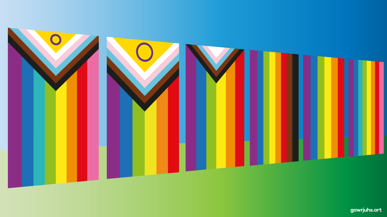
When Gilbert Baker created the Pride Flag in 1978, it had eight bands of colour: hot pink; red; orange; yellow; green; turquoise; indigo; and violet. But for mass production purposes two bands of colour were removed – hot pink and turquoise – to provide us with the commercial version of the Pride flag, which has become such an iconic symbol of the LGBTQ+ movement.
Since then there have been many iterations and variations of the Pride flag. In 2017 the city of Philadelphia adopted an eight striped version of the flag that added black and brown bands of colour to the top, to draw attention to the issues faced by people of colour within the LGBTQ+ community.
The following year Daniel Quasar released the Progress Pride flag design. Using the commercial Pride flag as its base, it adds white, light pink, light blue, brown and black chevrons to the hoist side of the flag. The new colours represent the trans community, people of colour, and those living with - and lost from - HIV/AIDS.
In 2021 Valentino Vecchietti produced another iteration – the Intersex Inclusive Pride flag – which folds Morgan Carpenter’s Intersex Pride flag into Daniel Quasar’s Progress Pride flag.
All this led me to wonder recently, what would the Pride flag look like, if it came full circle? So my iteration, which I’ve entitled “Heritage Pride” restores the eight bands of colour from Gilbert Baker’s original Pride flag. My intention here is to simply show the history and journey that this flag has made over the past 45 years. Which is in itself could be an appropriate subject matter for LGBT+ History Month.
Greetings Cards featuring this design are available to buy from my online [g]store.
