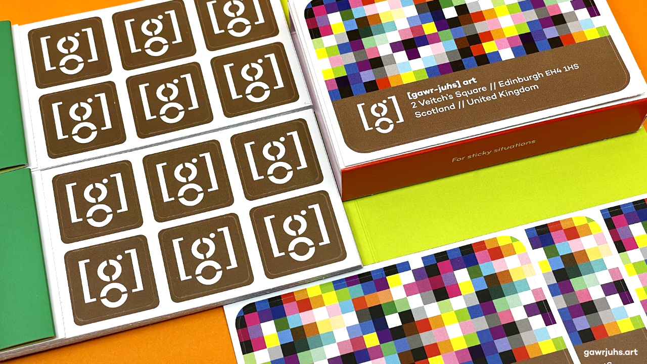
New Year, New [g]

After almost 12 years of trading as [gawr-juhs] the start of 2023 feels an appropriate time for a little brand refresh. This change signifies the direction that [gawr-juhs] art has brought about, and I consider it to be more representative of the work that I’m currently producing.
This redesign isn’t too radical. I’ve decided to drop the Transport serif stencil font, that was primarily used for the logotype and social media avatar. Campton is now my chosen font. It’s a modern geometric that I love, and have used in my identity in recent years.
After a little correspondence with type designer René Bieder, I discovered that he’s never created an alternate double-storey lowercase g for Campton. So I’ve developed a geometric mark of my own. This can be used as a standalone icon, or incorporated into my new visual signature.
My old branding will still be around for a little while though. I have lots of printed materials with it on, that are perfectly fine to use. But from this point forward any items that I have printed will display my new identity. So now you know what’s going on.
